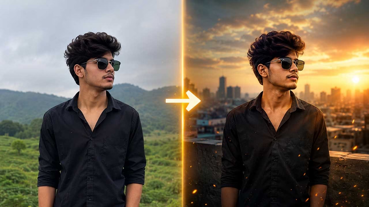
Sometimes the difference between an ordinary AI image and a convincing one is not a longer prompt, but a better choice of instruction. A short visual cue can tell the image model whether a photograph should feel like a studio portrait, a movie frame, an old film photograph, or a carefully composed advertisement. The image-editing code collection brings these visual directions into one organized system, covering photography, lighting, composition, atmosphere, artistic treatment, editing, and commercial use.
Think About the Result Before Choosing a Code
The most useful way to approach these codes is to start with the image you want rather than searching for the most impressive-looking term. If the subject needs to appear as a professionally captured portrait, /portrait gives the prompt a clear photographic direction. It is more useful when combined with an explanation of the subject, pose, setting, and expression. This keeps the instruction focused instead of allowing several unrelated effects to compete for attention.
Camera Language Can Change Perspective
Two images can contain exactly the same person and still feel completely different because of camera perspective. A low viewpoint can make a subject feel prominent, while a high viewpoint can produce a very different relationship between the subject and surroundings. The /topdown code is particularly useful when the intention is to view a scene from directly above. Camera-oriented instructions are therefore valuable not only for realism but also for controlling the visual relationship between objects within the frame.
Lighting Should Have a Specific Purpose
Lighting becomes more effective when it solves a visual problem. Instead of simply asking for a brighter photograph, decide whether the subject needs softer facial illumination, stronger separation, or a more dramatic atmosphere. /softlight, for example, suggests diffused illumination that can make a portrait appear gentler and less harsh. The lighting section contains many distinct approaches, which makes it possible to choose an effect according to the mood and subject rather than applying the same treatment everywhere.
Color Is More Than a Finishing Effect
Color can quietly influence how an image is interpreted. A muted palette may make a photograph feel understated, while stronger saturation can give it a more energetic character. /earthtones is useful when the desired appearance depends on natural browns, greens, beige shades, and related colors. Choosing a dominant palette before adding other visual effects can help prevent the final image from becoming visually confused.
Natural Portraits Need Restraint
AI editing can easily go too far with faces, particularly when the prompt repeatedly asks for enhancement, sharpness, and flawless skin. A more controlled approach is to decide which facial qualities actually need attention. /skintexture can be useful when realistic surface detail should remain visible instead of producing an unnaturally smooth appearance. This type of instruction is valuable for users who want a polished photograph while still retaining the character that makes a portrait believable.
Backgrounds Carry Part of the Story
Changing the background can alter the perceived purpose of a photograph even when the main subject remains untouched. A person photographed against a clean environment communicates something different from the same person surrounded by a busy city or natural landscape. The /naturebg code provides a straightforward way to suggest a natural setting. For better results, the prompt should describe the intended environment rather than relying on the code alone to invent every background detail.
Atmosphere Should Interact With the Scene
Fog, rain, snow, haze, and similar effects become convincing when they appear to belong to the environment. /mist, for instance, can introduce a lighter atmospheric layer without necessarily hiding the entire scene. The important consideration is density and interaction: distant objects may become less distinct, light may scatter differently, and surfaces may respond to weather. Treating atmosphere as part of the environment produces a more believable result than placing an effect over an otherwise unchanged photograph.
Fashion Codes Define Presentation
Fashion imagery often depends as much on presentation as on the clothing itself. Lighting, framing, environment, and styling all contribute to whether an image feels like a casual photograph or a professional campaign. /lookbook can establish a presentation associated with displaying a coordinated fashion collection. From there, the prompt can specify the outfit, pose, location, and intended composition without overwhelming the instruction with multiple style labels.
Artistic Styles Should Change the Treatment, Not the Idea
Creative transformation works best when the original concept remains recognizable. A photograph can be reinterpreted as a painting, illustration, sketch, or three-dimensional composition while preserving its central subject. /watercolor, for example, suggests a painted treatment rather than a conventional photographic finish. This makes artistic codes useful for creative reinterpretation, especially when the goal is to change the medium or visual language rather than simply improve image quality.
Composition Becomes Important When the Image Has a Job
An image created for a poster, thumbnail, advertisement, or banner has different spatial requirements from a personal photograph. Empty areas may be intentional because they provide room for text or branding. /negativeSpace is a useful example because it directs attention toward maintaining open visual space within the composition. Thinking about the final use before choosing a composition code can make the resulting image considerably more practical.
Editing Codes Are Best Used as Targeted Instructions
The final stage should focus on what actually needs to change. If an unwanted object distracts from the subject, /objectremove communicates a specific editing intention instead of requesting a vague improvement. Likewise, background replacement, color correction, sharpening, restoration, and perspective adjustments each address different problems. Using one targeted instruction at a time can make revisions easier and helps keep the prompt from becoming a collection of contradictory demands.
Download Codes
A Good Code Supports the Prompt Rather Than Replacing It
The strongest use of these codes is surprisingly simple: describe the image naturally, then use a relevant code to reinforce the particular visual direction that matters most. /poster, for example, can establish the intended design format while the rest of the prompt explains the subject, text placement, background, proportions, and overall mood. The collection works best as a vocabulary for visual decisions, not as a list that must be copied into every request. When each instruction has a clear purpose, image editing becomes more controlled, repeatable, and easier to refine.